An elegant visual identification for an international business, swimming in the ocean of the renewable power sources.
AN EXTRAORDINARY PROJECT.
Our client, busies himself with engineering projects in the field of sanitary and compiling audits (in the field of energetics and business). The goal of this company is to introduce optimal solutions to every investor, so that engineering becomes of use to people, not the other way around.
LINES AS THE FEATURE OF THE BRAND.
Due to the briefing it became clear to create a minimalistic and timeless design – universal. Inspired by the human and the forces of nature we made an EFP symbol, which resembles dynamism, flow, nature and ecology. We wanted to make the shapes spell the letter “e”, alluding to the name of the company, giving it identity.
MADE WITH AN IDEA.
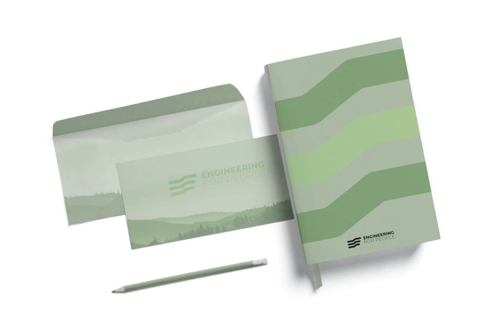
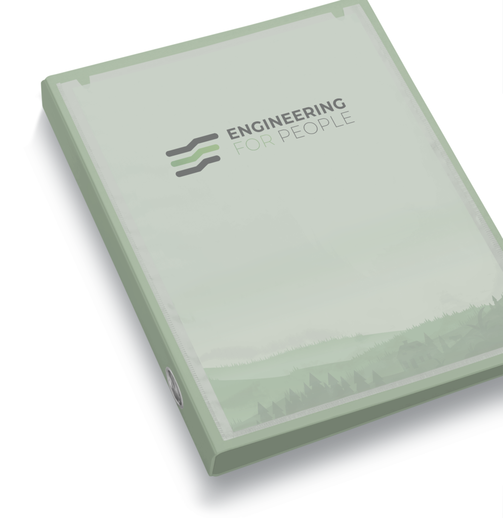
“4” couldn’t be used in the logotype, because for the Chinese it brings bad luck. We had decided to use three gradients – each representing one of the offered services – which we have neatly put in the design of the: car, binder, envelope and the calendar. We also included a reduced iteration of the symbol for other, special uses.
MADE WITH AN IDEA.
“4” couldn`t be used in the logotype, because for the Chinese it brings bad luck. We had decided to use three gradients – each representing one of the offered services – which we have neatly put in the design of the: car, binder, envelope and the calendar. We also included a reduced iteration of the symbol for other, special uses.
Details.
Execution Visual identification, the design of the: binder, envelope and the sticker to put on a car.
Trade Renewable power sources, audits for the fields of energetics & business.
Date March 2020.
DO YOU LIKE IT
YOU ALSO WANT ONE?
Fulfil your dreams and make your project come to fruition. We’re waiting!